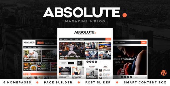
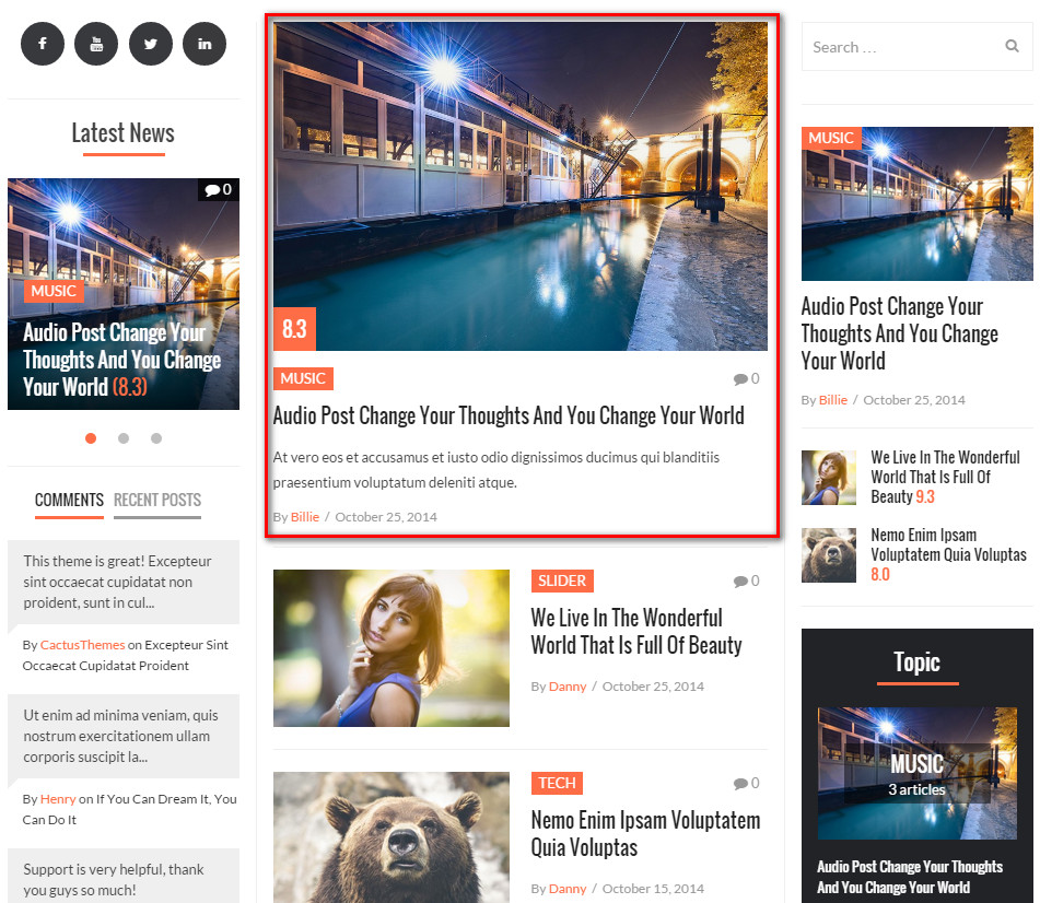
Absolute - News and Magazine WordPress Theme
The Documentation
- October 1st 2014
- Latest Update: November 3rd 2014
- By: CactusThemes
- http://themeforest.net/user/cactusthemes
- Email: [email protected]
For support please checkout CACTUSTHEME SUPPORT FORUM
Absolute - News and Magazine WordPress Theme
Theme description
Created By: CactusThemes.com
Support Site: http://ticket.cactusthemes.com
Version: 1.0
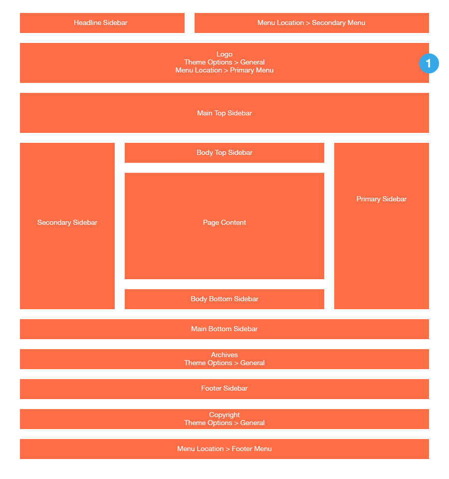
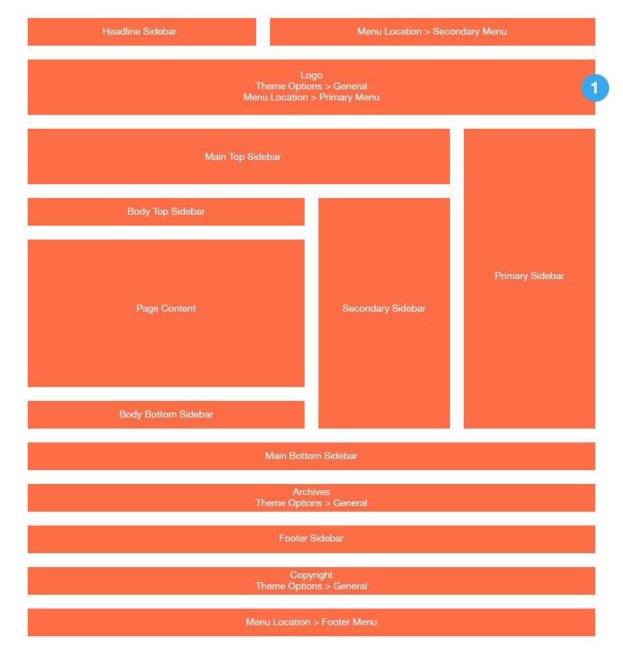
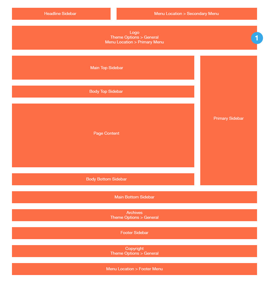
Theme Layout
Layout 1
Layout 2
Layout 3

Layout 4

Layout 5

Layout 6

Layout 7
Header Layouts

Installation
- Documentation folder - Contain this document and other materials
- Installation Files folder - Contain all installable files, including theme & plugins
- themes/absolute.zip - Absolute WordPress Theme
- plugins/plg-cactus-rating.zip - A plugin which enables Rating feature for theme
- plugins/plg-easy-tab.zip - Allow to put widgets in a tab.
- plugins/plg-visual-composer.zip - Visual Composer plugin, a drag&drop page builder (Premium).
Install via WordPress
- Login to WordPress Admin
- In the left menu panel go to Appearance > Themes > Add New to install theme, or Plugins > Add New > Upload to install plugins
- Click Upload
- Browse your download package to select installation files
- Click Install Now button.
- Once it's uploaded, click the Activate link
Install via FTP
- Use your FTP software to browse to wp-content/themes folder to install theme or wp-content/plugins folder to install plugins
- Extract the installation files to their corresponding folders, for example absolute.zip to absolute and upload to server
- Once it's uploaded, go to your WordPress Admin, browse to Appearance > Themes or Plugins > Installed Plugins
- Click the Activate link
Go to Plugins > Add New to install and activate plugins
- Contact Form 7 - Simple but flexible contact form plugin
- WP PageNavi - Add a more advanced paging navigation to your WordPress blog
- Custom Sidebars - Allow you to create widgetized areas and custom sidebars. Replace whole sidebars or single widgets for specific posts and pages.
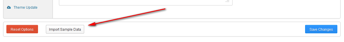
Install Sample Data
One+ Click Install
Before starting, It is noted that
- It is better to install sample data on a fresh Wordpress installation. Therefore, you may want to reset your site to default settings. Install and use Wordpress Reset plugin to do that. After installed, go to Tools > Reset
- The import process may take several minutes due to large data and your server capacity. If your server setting "Max Execution Time" is too low, increase it (as your hosting provider). Please do not close the browser until it finishes. If it fails, you can run this process again until seeing the "Success Message". Demo Images are not installed due to some copyrighted licenses
- If you have to run the process more than once, menu items may be duplicated. Just go to Appearance > Menus and edit/delete Main Menu items
- Feature images are not imported (We use licensed photos on our demo page)
Import Manually
- absolute.xml All Data
- theme-options.txt Theme Options Settings
- absolute-widgets.json Widgets Settings

Setup custom Front-page
By default, your front-page (the first page that visitors see) is blog posts page, which lists all posts in time-order. To change the front-page into a custom page, follow these two steps:
- Create two new pages in WordPress (under Pages > Add new), and publish them.
For the purpose of demonstration, we’ll call these “Home” (for the Front, or Home page) and “Blog”. - Go to Settings > Reading Settings, and under “Front page displays”, click the radio button for A static page.
Select “Welcome” in the first drop down (for Front page), and select “Blog” in the second one (for Posts page). Save the changes.
Page Templates
Absolute provides page templates to configure special Front-page (or any static page that you like)
- Go to Pages > All Pages and edit “Home” page created in previous step
- In Template selectbox, choose one of predefined page templates.
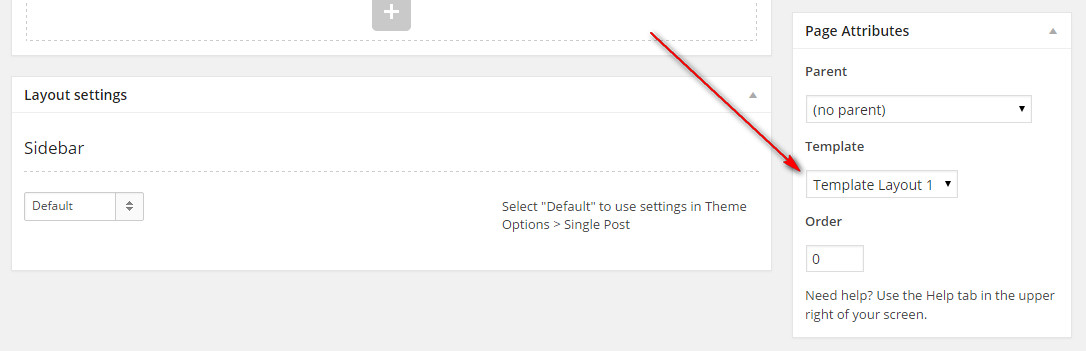
- There are seven page templates in related to seven theme layout. Check Theme Layout
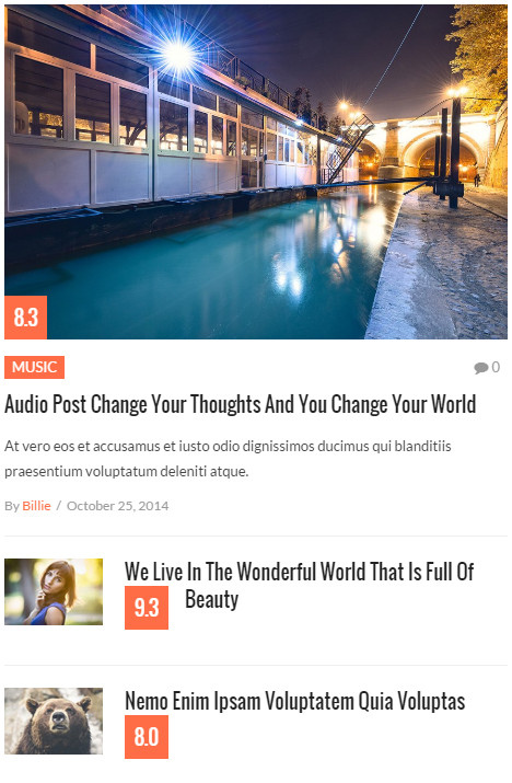
- In content editor of page, enter your custom content. We recommend using Visual Composer plugin (included in your download package) and adding shortcode elements. For example, our Home Page v1 is configured to use Template Layout 1 with this shortcode in content
[scb layout="Layout 1" sort="DESC" count="7" condition="latest" heading_alignment="center" heading_style="line"]
- Based on the layout maps, you will know the positions of sidebar where you can put content. Now go to Appearance > Widgets and drag widgets into corresponding sidebars.
- Tips: install and use Widget Logic plugin to control the appearance of widgets in different pages. For example, we only want a text widget to display in our demo Home Page v2 page and the Front-page only, we use these Condition Tags:

Main Navigation
- Primary Menu
- Secondary Menu
- Footer Menu
Existing Menu
- Go to Appearance > Menus
- In the Manage Locations area, under Main Navigation, select menu for Primary Menu, Secondary Menu or Footer Menu. Click Save

Creating a New Menu
Go to to Appearance > Menus
Click Create a new menu. Enter a menu's name and click Create Menu
Check the menu item in the boxes in the left column, click Add to Menu to add items to the menu and drag/drop to arrange them.

If you would like to use this menu in navigation, in the Manage Locations area, assign your newly created menu to Primary Menu, Secondary Menu or Footer Menu. Click Save
Click Save Menu and that is all
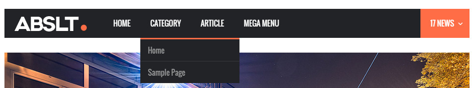
Mega Menu
List Style
List Style is the traditional dropdown-menu style.

We call Parent Level Menu Level 0. Then, next levels are Level 1, Level 2...
- Add Menu Level 0, Level 1... normally using drag & drop
-
Click on a Menu Level 0 (Parent Level Menu ) item and select List Style in Menu Style selectbox (this selectbox is only displayed for Menu Level 0)
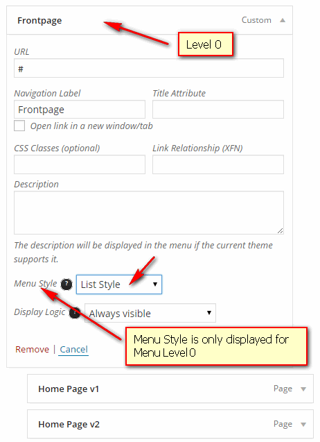
- You can configure Display Logic option to control the appearance of this menu item
- Always visible - Always display menu for Guests and Admin Users. It is visible
- Only Visible to Guests - Menu is only displayed for Guests when they visit your website, but not display for Admin Users
- Only Visible to Members - Menu is only displayed for User Members, but not display for Guests
- Click save
Column Style
- Column Style MUST HAVE Level 0, Level 1 (also called Heading of Column), and Level 2 menu items.
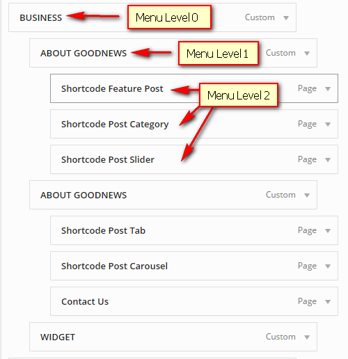
- Click on a Level 0 menu item and select Column Style in Menu Style (Menu Style is only displayed for Menu Level 0)

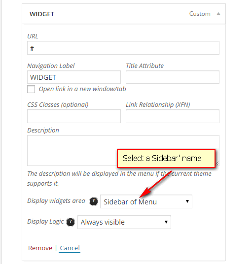
- To put a widget into a column, (widget is only put into Level 1), prepare a sidebar to contain widgets first. It is recommdended to use Custom Sidebar plugin to register new sidebar for this purpose. Then, drag widgets that you want to display in menu into the new Sidebar.
After widgets are set up, go back Menus and click on a Level 1 menu item. Choose sidebar in Display widgets area.Note: Display widgets area is only displayed in Menu Level 1
- You can configure Display Logic option to control the appearance of this menu item
- Always visible - Always display menu for Guests and Admin Users. It is visible
- Only Visible to Guests - Menu is only displayed for Guests when they visit your website, but not display for Admin Users
- Only Visible to Members - Menu is only displayed for User Members, but not display for Guests
- Click save
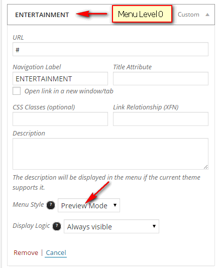
Preview Mode

- In this mode, menu only has 2 levels (Level 0 and Level 1). Level 1 MUST BE one of the following type: Categories, Tags, Posts, Pages and WooCommerce/JigoShop Product Categories
- Click on Level 0 menu item and select Preview Mode in Menu Style (Menu Style is displayed for Menu Level 0)
- You can configure Display Logic option to control the appearance of this menu item
- Always visible - Always display menu for Guests and Admin Users. It is visible
- Only Visible to Guests - Menu is only displayed for Guests when they visit your website, but not display for Admin Users
- Only Visible to Members - Menu is only displayed for User Members, but not display for Guests
- Click save
Widgets
Go to Appearance > Widgets and drag one of these widgets into your desired Sidebar. See Theme Layout map for more information about locations of Sidebar
- Absolute - Headline widget
- Headline Text - Text that appears before item titles
- Category - Category IDs or slugs to query posts, separated by a comma
- Tags - Tags to query posts, separated by a comma
- Post IDs - IDs of posts to display, seperated by a comma. If this parameter is used, other parameters are ignored.
- Number of headlines - Number of posts to display

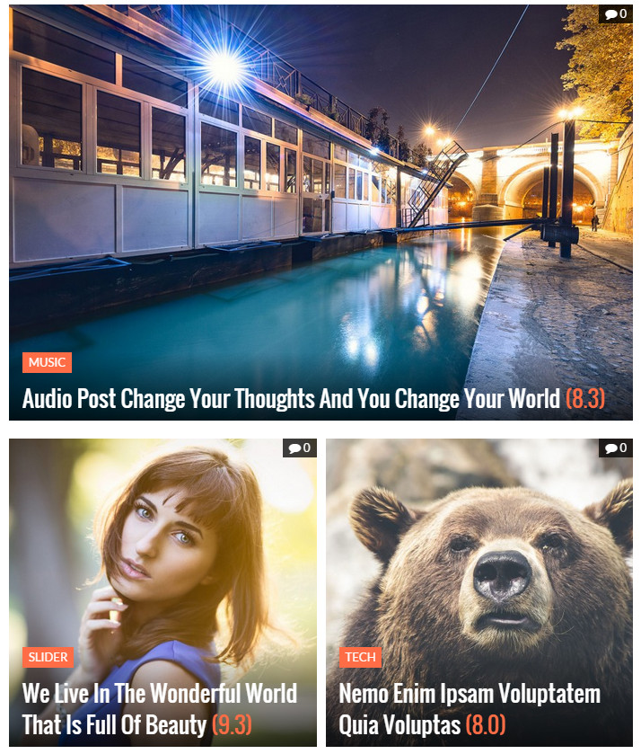
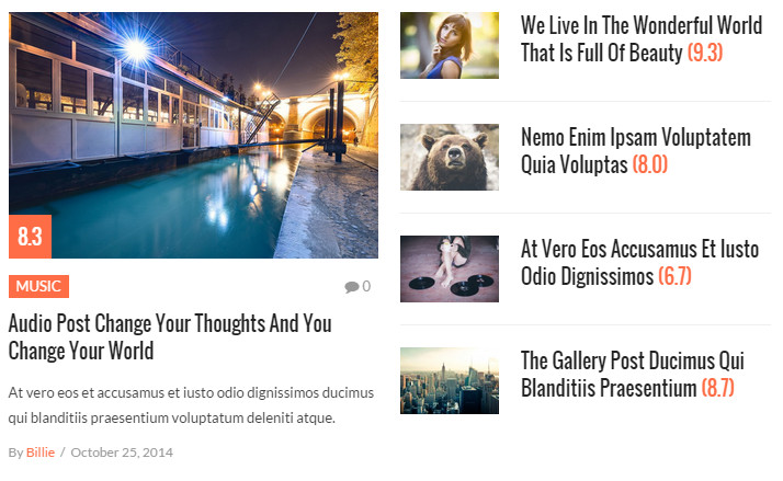
- Absolute - Recent Posts Widget
- Widget Layout - Choose one of several layouts provided
- Category - Category IDs or slugs to query posts, separated by a comma
- Tags - Tags to query posts, separated by a comma
- Post IDs - IDs of posts to display, seperated by a comma. If this parameter is used, other parameters are ignored.
- Number of posts - Number of posts to display
IMAGE OF 4 LAYOUTS
- Absolute - Banner Widget
- Title - Title of widget
- Banner Image URL - URL of banner image
- Banner Heading - Heading text inside banner
- Banner Text - Content text inside banner
- Button Text - Text on button inside banner
- Button Link - Link to navigate when clicking on the button
- Link Target - Whether to open link in new tab or in current page

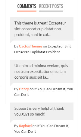
- Absolute - Recent Comments Widget
- Title - Title of widget
- Number of comments to show - Number of comments to show
- Absolute - Social Accounts Widget
- Title - Title of widget
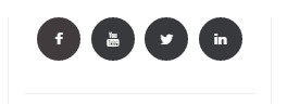
Social Accounts are configured in Appearance > Theme Options > Social Accounts
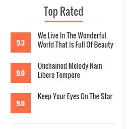
- Absolute - Top Rated widget (available when Rating plugin is installed)
- Number of posts - default 3
- Time range (select)- Period of time to count for top rated videos
- 1 day
- 1 week
- 1 month
- 1 year
Theme Options
General
- Logo Image: Upload your logo image
- Retina Logo (optional): Retina logo should be two time bigger than the custom logo. Retina Logo is optional, use this setting if you want to strictly support retina devices.
- Favicon: Upload favicon (.ico) is image file of page's title section
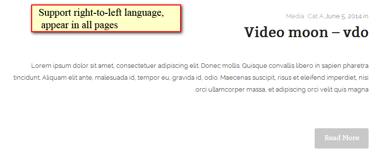
- RTL: Support right-to-left language
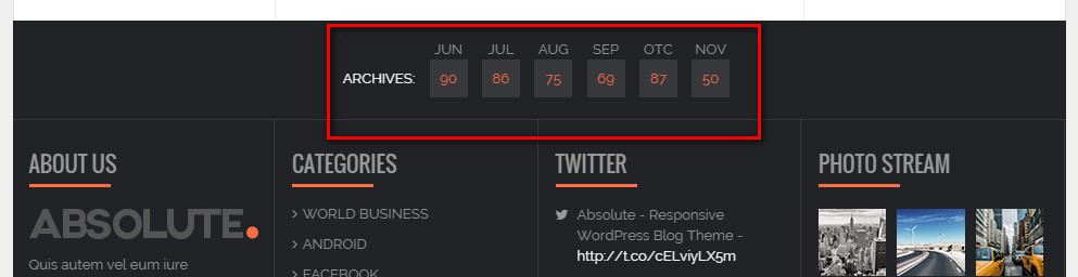
- Show Archive: Show Archive Link in footer
- Use default gallery shortcode: Use default WordPress Gallery shortcode. Otherwise, theme will use its own Gallery layout
- Custom CSS: Enter custom CSS. Ex: .class{ font-size: 13px; }
- Custom Code: Enter custom code or JS code here. For example, enter Google Analytics
- Copyright Text: Appear in footer
- Number of Easy Tabs: Enter number of easy tabs to generate (Easy Tab plugin is required)
- Latest News Section - Number of days: Number of days to count for latest news
- Latest News Section - Maximum number of articles: Maximum number of articles to display
- Pre-loading Effect: Enable Pre-loading effect (a loading icon will be shown until all elements on page are downloaded and ready to show)

Layout & Fonts
- Theme Width: Choose between 970px or 1170px layout
- Background: Set theme background
- Main Color: Choose main color of theme (default- #fe6d46)
- Google Fonts: Use Google Fonts or not. If "on", fonts ared loaded from Google Fonts Directory
- Main Font: Enter font-family name here (default - Raleway). Google Fonts are supported. For example, if you choose "Source Code Pro" Google Font with font-weight 400,500,600, enter Source Code Pro: 400,500,600
- Main Font Size: Select base font size
- Secondary Font: Enter font-family name here (default - Raleway). Google Fonts are supported. For example, if you choose "Source Code Pro" Google Font with font-weight 400,500,600, enter Source Code Pro: 400,500,600
- Secondary Font Size: Select base font size
- Navigation Font: Enter font-family name for Main Navigation. Google Fonts are supported. For example, if you choose "Source Code Pro" Google Font with font-weight 400,500,600, enter Source Code Pro: 400,500,600
- Navigation Font Size: Select font size for Main Navigation
Header
- Header Layout Choose beetween pre-defined header layouts
Header Layout 1
Header Layout 2
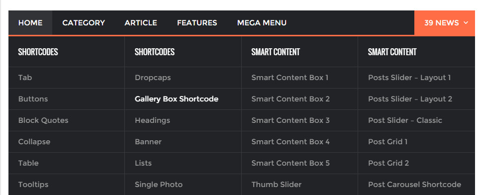
Header Layout 3 - Mega Menu: Enable Mega Menu
Default DropDown Menu
Mega MenuSee Main Nagivation for building menu
Single Post
- Scroll To Next Posts: When users scroll to bottom of a single post, next posts will be loaded automatically
- Scroll Next Condition: Choose how to load next posts
- Next posts in all blog
- Next posts in same Categories
- Next posts in same Tags
- Next posts in Custom Categories
- Next posts in Custom Tags
- Scroll Next Posts in Custom Taxonomies: Enter list of taxonomies, separated by a comma (only works when Scroll Next Condition is set to Custom Categories or Custom Tags
- Scroll Next Order: Load newer posts or older posts
- Layout: Choose between 2 layouts
Single Post Layout 1
Single Post Layout 2 - Floating Sidebar: Enable Floating feature for main sidebar in single post
- Show Featured Image: Show/hide featured image in single post
- Sidebar: Hide/show left or right Sidebar
- Show Tags: Show/hide Tags in single post
- Show Social Buttons: Show/hide Social Buttons in single post
- Show About the Author: Show/hide about the author in single post
- Show Related Posts: Show/hide related posts in single post
- Related Posts by: Get related posts by categories or tags
- Related Posts Order by: Related posts order by date or random
- Number of related posts: Number of related posts
- Show Posts Navigation: Show/hide post navigation
- Post Navigating by: Choose how the Post Navigation buttons work
- Navigate in blog order (all categories)
- Navigate in same categories
- Navigate in same tags
- Show Comments: Show/hide comment in single post
Blog/FrontPage
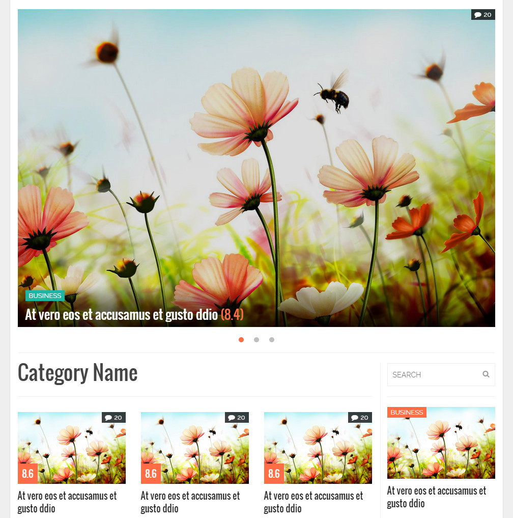
- Blog Layout: Choose layout for blog. The layout map is the same with Page Template Layout
- Number of leading articles: Enter number of leading articles in blog page. Leading articles are articles having larger width than the rest
- Hide Main Top in next pages: Hide Main Top sidebar in next pages
- Hide Body Top in next pages: Hide Body Top sidebar in next pages
- Number of colummns in blog: Choose number of columns in blog (1 or 2 columns)
Archives
- Sidebar: Choose default sidebar position for an archive page. It can be overridden in each category page
- Right Sidebar: Archives pages with the right sidebar (default)
- Left Sidebar: Archives pages with the left sidebar
- Hidden sidebar: Archives pages without sidebar (These pages are full-width)
- Columns: Choose number of columns in blog (1, 2 or 3 columns)
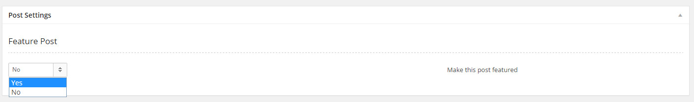
- Featured Posts Count: Enter number of Featured Posts to show in category' header
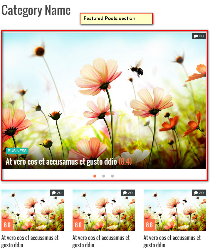
Featured Posts are posts that marked Featured when you editing a post
- Category Featured Posts Position: Choose position for the Featured Posts section in a category page, whether it is full-width or in main column
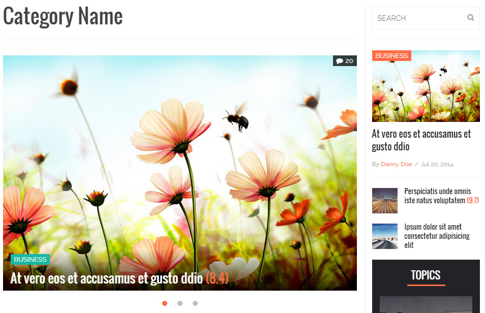
In-column Featured Posts section
Full-width Featured Posts section
- Category Featured Posts Presentation: Choose type of presentation for the Featured Posts section in a category page
- Page Pagination: Choose type of pagination for all archives pages. There are 2 options: Default WordPress and WP PageNavi. If you choose WP PageNavi, make sure you have installed WP-PageNavi plugin in advanced
- Default WordPress
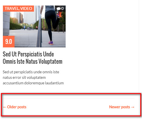
- WP PageNavi

- Default WordPress
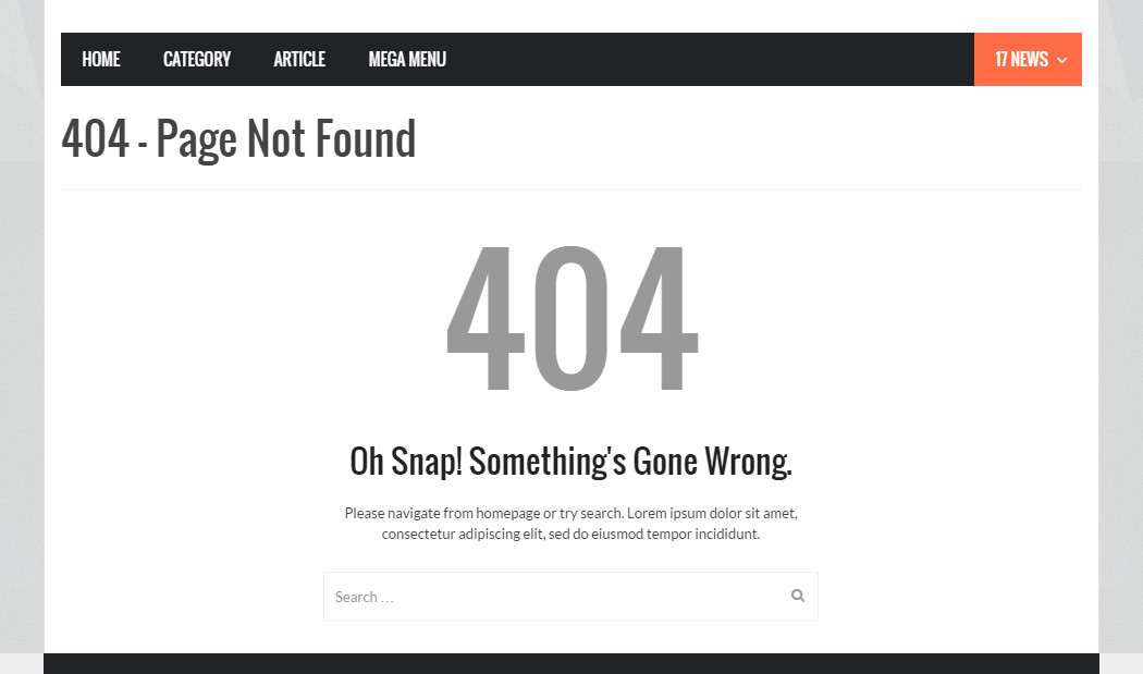
404 - Page Not Found
- Page Title: Enter title for announcing page
- Page Sub Title: Enter sub title
- Page Content: Enter page content
- Search Form: Enable Search Form in 404 page
Social Accounts
Turn on/turn off Social items. Social Account icons appear in Absolulte - Social Accounts widget
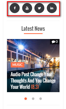
- Facebook: Enter full link to your profile page
- Twitter:Enter full link to your profile page
- LinkedIn: Enter full link to your profile page
- Tumblr: Enter full link to your profile page
- Google Plus: Enter full link to your profile page
- Pinterest : Enter full link to your profile page
- YouTube : full link to your profile page
- Flickr : Enter full link to your profile page
- Open Social Link in new tab: Open link in new tab?
Sharing
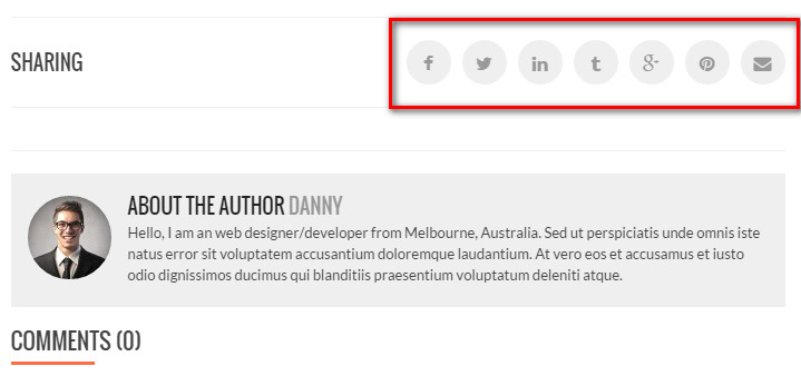
- Facebook: Enable Facebook Share button
- Twitter: Enable Twitter Share button
- LinkedIn : Enable LinkedIn Share button
- Tumblr : Enable Tumblr Share button
- Google +: Enable Google+ Share button
- Pinterest: Enable Pinterest Pin button
- Email: Enable Email button
Advertising
- Google AdSense Publisher ID: Enter your Google AdSense Publisher ID
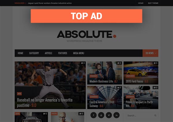
- Top Ads - AdSense Ads Slot ID: If you want to display Adsense in Top, enter Google AdSense Ad Slot ID here. If left empty, "Top Ads - Custom Code” will be used
- Top Ads - Custom Code: Enter custom code for Top Ads
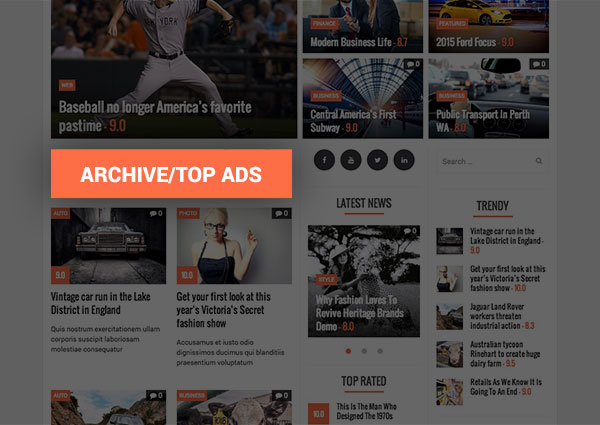
- Archive/Top Ads - AdSense Ads Slot ID: If you want to display Adsense on Top of Archive pages, enter Google AdSense Ad Slot ID here. If left empty, "Archive/Top Ads - Custom Code” will be used.
- Archive/Top Ads - Custom Code: Enter custom code for Archive/Top Ads
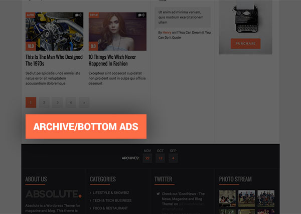
- Archive/Bottom Ads - AdSense Ads Slot ID: If you want to display Adsense at Bottom of Archive page, enter Google AdSense Ad Slot ID here. If left empty, "Archive/Bottom Ads - Custom Code” will be used.
- Archive/Bottom Ads - Custom Code: Enter custom code for Archive/Bottom Ads
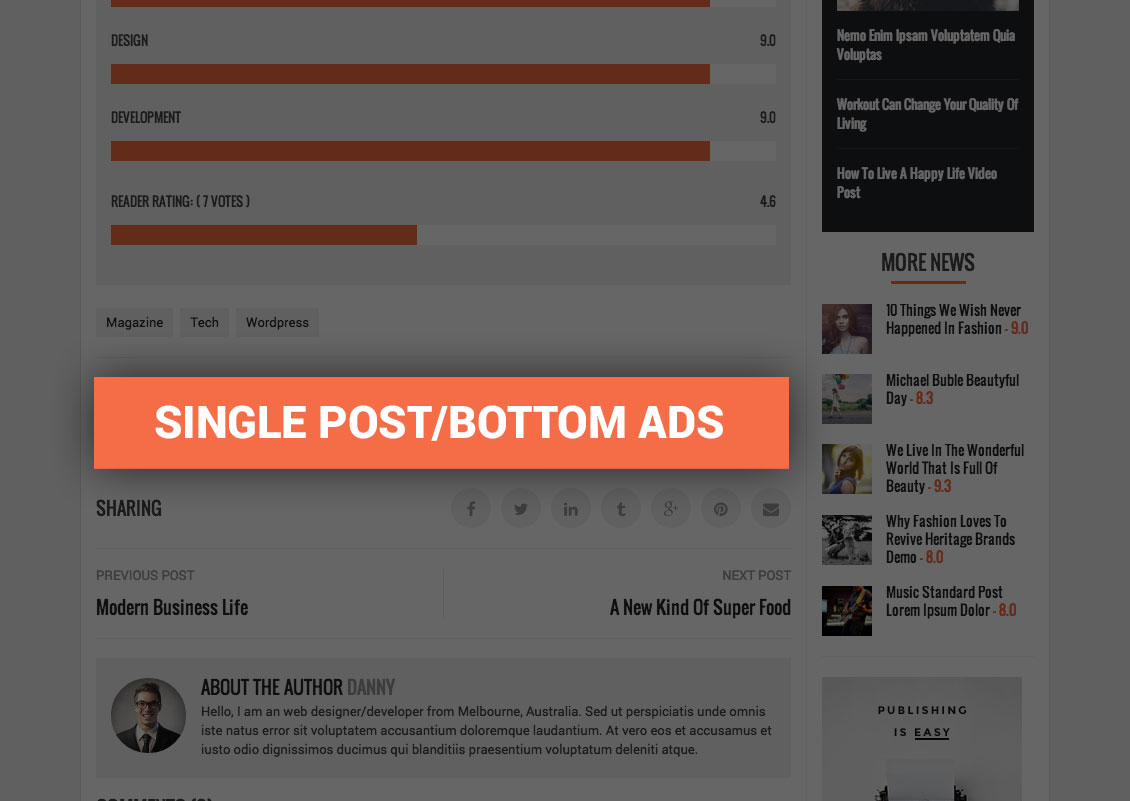
- Single Post/Top Ads - AdSense Ads Slot ID:If you want to display Adsense on Top of Single Post, enter Google AdSense Ad Slot ID here. If left empty, "Single Post/Top Ads - Custom Code” will be used.
- Single Post/Top Ads - Custom Code: Enter custom code for Single Post/Top Ads

- Single Post/Bottom Ads - AdSense Ads Slot ID: If you want to display Adsense at Bottom of Single Post , enter Google AdSense Ad Slot ID here. If left empty, "Single Post/Bottom Ads - Custom Code” will be used.
- Single Post/Bottom Ads - Custom Code: Enter custom code for Single Post/Bottom Ads
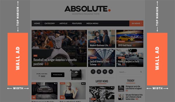
- Wall Ads Left - AdSense Slot ID: If you want to display Adsense in Wall Ads Left, enter Google AdSense Ad Slot ID here. If left empty, "Wall Ads Left - Custom Code" will be used
- Wall Ads Left - Custom Code: Enter custom code for Wall Ads Left
- Wall Ads Left - Width: Specify width for Wall Ads Left, in pixels
- Wall Ads Left - Top Margin: Specify top margin for Wall Ads Left, in pixels
- Wall Ads Right - AdSense Slot ID: If you want to display Adsense in Wall Ads Right, enter Google AdSense Ad Slot ID here. If left empty, "Wall Ads Right - Custom Code" will be used
- Wall Ads Right - Custom Code: Enter custom code for Wall Ads Right
- Wall Ads Right - Width: Specify width for Wall Ads Right, in pixels
- Wall Ads Right - Top Margin: Specify top margin for Wall Ads Right, in pixels
Auto Update
- Envato Username: Enter your Envato username.
- Envato API: Enter your Envato API. You can find your API under in your Envato Profile page > My Settings > API Keys
- Allow Auto Update: Allow Auto Update or Not. If not, you can come back here and click on the "Update Theme" button

Absolute - Shortcodes
Shortcodes can be used in either Classic Editor or Visual Composer mode (require Visual Composer plugin installed). You can type shortcode directly in Classic Editor or use Visual Composer element to configure the shortcode
Posts Carousel
- id (optional) - text - HTML ID for element
- post_type (optional) – text - default ‘post’
- max_visible (optional) – select - maximum number of visible items
- cats (optional) - text - list of categories ID (or slug), separated by a comma
- tags (optional) - text - list of tags, separated by a comma
- count (optional) - number - number of items to show
- heading (optional) - text - number of items to show
- heading_style (optional) - select - choose heading style
- line
- box

- line
- heading_alignment (optional) - select - choose text alignment on heading
- 'center'
- 'left'
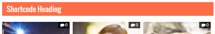
- 'right'
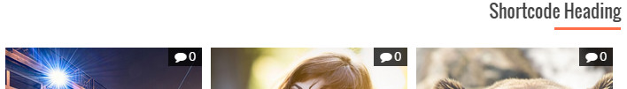
- 'center'
- heading_bg (optional) - hexa color - color of heading background (box style). For example, #FF0000
- item_ids (optional) - text - list of item ids, separated by a comma. To use if you want to display specific posts
- condition (optional) - select - how to order items
- 'latest' - order by published date
- 'most_viewed' - order by number of views of posts
- 'most_comments' - order by number of comments of posts
- 'high_rated' - order by rating value of posts
- 'title' - order by title of posts
- 'modified' - order by modified date of posts
- 'random' - order randomly
- sort (optional) - select - Sort items
- 'asc' - Ascending
- 'desc' - Descending
Posts Classic Slider
- id (optional) - text - HTML ID for element
- post_type (optional) – text - default ‘post’
- cats (optional) - text - list of categories ID (or slug), separated by a comma
- tags (optional) - text - list of tags, separated by a comma
- count (optional) - number - number of items to show
- heading (optional) - text - number of items to show
- heading_style (optional) - select - choose heading style
- line
- box
- line
- heading_alignment (optional) - select - choose text alignment on heading
- 'center'
- 'left'
- 'right'
- 'center'
- heading_bg (optional) - hexa color - color of heading background (box style). For example, #FF0000
- item_ids (optional) - text - list of item ids, separated by a comma. To use if you want to display specific posts
- condition (optional) - select - how to order items
- 'latest' - order by published date
- 'most_viewed' - order by number of views of posts
- 'most_comments' - order by number of comments of posts
- 'high_rated' - order by rating value of posts
- 'title' - order by title of posts
- 'modified' - order by modified date of posts
- 'random' - order randomly
- sort (optional) - select - Sort items
- 'asc' - Ascending
- 'desc' - Descending
Posts Slider
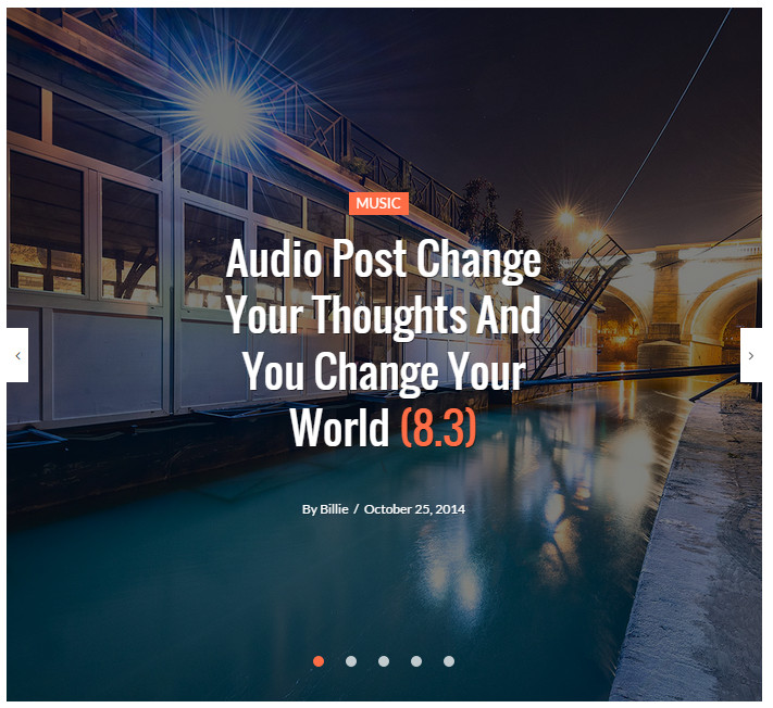
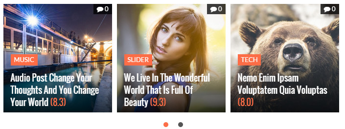
Posts Slider Style 1
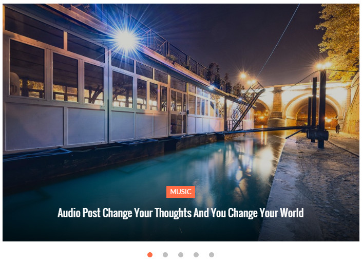
Posts Slider Style 2
- id (optional) - text - HTML ID for element
- post_type (optional) – text - default ‘post’
- layout (optional) – select - choose between layout 1 and layout 2
- cats (optional) - text - list of categories ID (or slug), separated by a comma
- tags (optional) - text - list of tags, separated by a comma
- count (optional) - number - number of items to show
- heading (optional) - text - number of items to show
- heading_style (optional) - select - choose heading style
- line
- box
- line
- heading_alignment (optional) - select - choose text alignment on heading
- 'center'
- 'left'
- 'right'
- 'center'
- heading_bg (optional) - hexa color - color of heading background (box style). For example, #FF0000
- item_ids (optional) - text - list of item ids, separated by a comma. To use if you want to display specific posts
- condition (optional) - select - how to order items
- 'latest' - order by published date
- 'most_viewed' - order by number of views of posts
- 'most_comments' - order by number of comments of posts
- 'title' - order by title of posts
- 'modified' - order by modified date of posts
- 'random' - order randomly
- sort (optional) - select - Sort items
- 'asc' - Ascending
- 'desc' - Descending
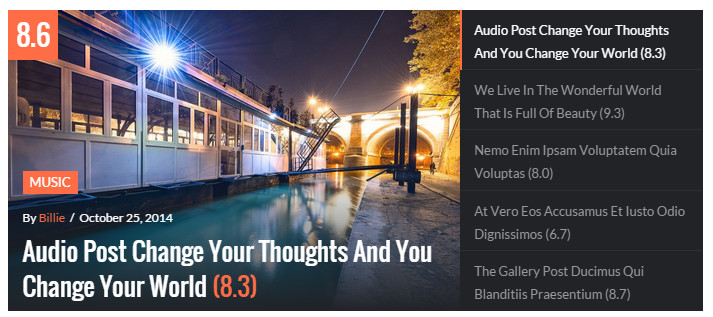
Posts Grid
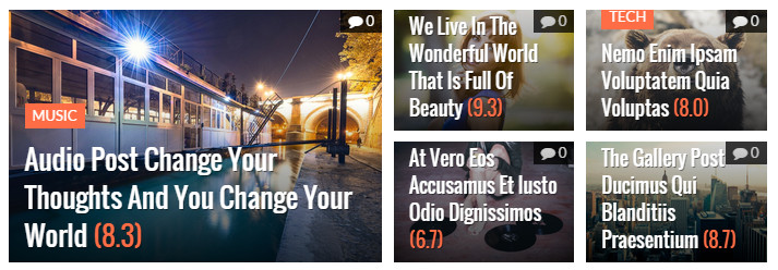
Posts Grid Style 1

Posts Grid Style 2
- id (optional) - text - HTML ID for element
- post_type (optional) – text - default ‘post’
- layout (optional) – select - choose between layout 1 and layout 2
- cats (optional) - text - list of categories ID (or slug), separated by a comma
- tags (optional) - text - list of tags, separated by a comma
- heading (optional) - text - number of items to show
- heading_style (optional) - select - choose heading style
- line
- box
- line
- heading_alignment (optional) - select - choose text alignment on heading
- 'center'
- 'left'
- 'right'
- 'center'
- heading_bg (optional) - hexa color - color of heading background (box style). For example, #FF0000
- item_ids (optional) - text - list of item ids, separated by a comma. To use if you want to display specific posts
- condition (optional) - select - how to order items
- 'latest' - order by published date
- 'most_viewed' - order by number of views of posts
- 'most_comments' - order by number of comments of posts
- 'high_rated' - order by rating value of posts
- 'title' - order by title of posts
- 'modified' - order by modified date of posts
- 'random' - order randomly
- sort (optional) - select - Sort items
- 'asc' - Ascending
- 'desc' - Descending
Posts Thumb Slider
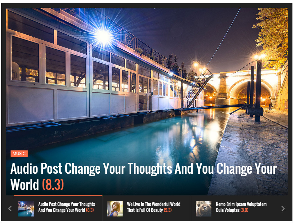
Posts Thumb Slider
- id (optional) - text - HTML ID for element
- post_type (optional) – text - default ‘post’
- cats (optional) - text - list of categories ID (or slug), separated by a comma
- tags (optional) - text - list of tags, separated by a comma
- count (optional) - number - number of items to show
- heading (optional) - text - number of items to show
- heading_style (optional) - select - choose heading style
- line
- box
- line
- heading_alignment (optional) - select - choose text alignment on heading
- 'center'
- 'left'
- 'right'
- 'center'
- heading_bg (optional) - hexa color - color of heading background (box style). For example, #FF0000
- item_ids (optional) - text - list of item ids, separated by a comma. To use if you want to display specific posts
- condition (optional) - select - how to order items
- 'latest' - order by published date
- 'most_viewed' - order by number of views of posts
- 'most_comments' - order by number of comments of posts
- 'high_rated' - order by rating value of posts
- 'title' - order by title of posts
- 'modified' - order by modified date of posts
- 'random' - order randomly
- sort (optional) - select - Sort items
- 'asc' - Ascending
- 'desc' - Descending
Smart Content Box
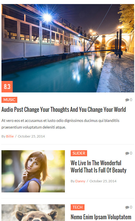
Smart Content Box Layout 1

Smart Content Box Layout 2
Smart Content Box Layout 3
Smart Content Box Layout 4
Smart Content Box Layout 5
- id (optional) - text - HTML ID for element
- post_type (optional) – text - default ‘post’
- layout (optional) – select - choose between 5 layouts
- cats (optional) - text - list of categories ID (or slug), separated by a comma
- tags (optional) - text - list of tags, separated by a comma
- count (optional) - number - number of items to show
- leading (optional) - number - number of leading items, applied for Layout 1 & 2
- heading (optional) - text - number of items to show
- heading_style (optional) - select - choose heading style
- line
- box
- line
- heading_alignment (optional) - select - choose text alignment on heading
- 'center'
- 'left'
- 'right'
- 'center'
- heading_bg (optional) - hexa color - color of heading background (box style). For example, #FF0000
- item_ids (optional) - text - list of item ids, separated by a comma. To use if you want to display specific posts
- condition (optional) - select - how to order items
- 'latest' - order by published date
- 'most_viewed' - order by number of views of posts
- 'most_comments' - order by number of comments of posts
- 'high_rated' - order by rating value of posts
- 'title' - order by title of posts
- 'modified' - order by modified date of posts
- 'random' - order randomly
- sort (optional) - select - Sort items
- 'asc' - Ascending
- 'desc' - Descending
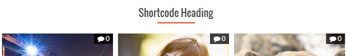
Topic

- cat (required if tag is empty) - text - category ID or slug
- tag (required if cat is empty) - text - tag
- count (optional) - number - number of items to show
- heading (optional) - text - number of items to show
- heading_style (optional) - select - choose heading style
- line
- box
- line
- heading_alignment (optional) - select - choose text alignment on heading
- 'center'
- 'left'
- 'right'
- 'center'
- heading_bg (optional) - hexa color - color of heading background (box style). For example, #FF0000
Banner

- url (required) - URL - Full URL of image banner
- heading - text - Heading text on banner
- text - text - Content text on banner
- button - text - Button text on banner
- link - URL - URL to navigate if clicking on button
- target - text - To open link in new tab
- align - text - Alignment of banner
Button

- href (required) - URL - URL to navigate
- size (optional) – select - default “small”
- {empty} - Small button
- 'btn-lg' - Large button
- target (optional) - select - to open link in new tab
- {empty} - open link in current tab
- '_blank' - open link in new tab
Dropcaps
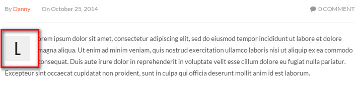
 on formatting toolbar > choose Dropcap
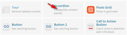
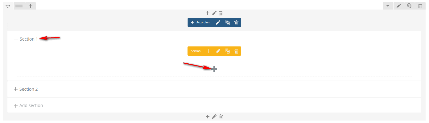
Accordion & Toggle

Tab


Gallery

Adsense
- 'pub' - Google Adsense Publisher ID
- 'slot' - Google Adsense Slot ID
- 'class' - Custom CSS class
Other settings
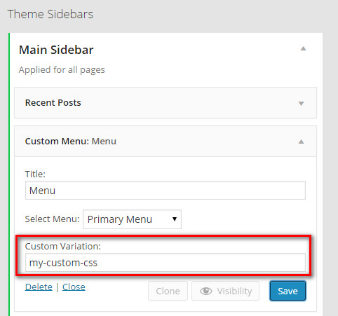
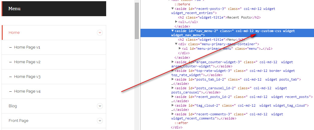
Widget Custom Variation
In every widgets, there is a textbox called Custom Variation. It is used when you want to customize the widget using custom CSS. The value entered in this textbox is added to the CSS class property of the widget box in front-end, then you can write CSS for this widget
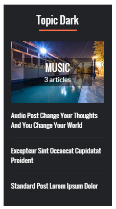
Dark and Light Widgets
To use Dark version of a widget, enter 'dark' into Custom Variation field of that widget

Widget Heading Alignment
To align widget heading to left, center or right, use 'head-center', 'head-left', or 'head-right' value in Custom Variation field of that widget
Sticky Sidebar/Widget
If you want the Primary sidebar to stick at top of the page when users scroll down, go to Theme Options > Single Post > Floating Sidebar and turn on this option. This option only works in Single Post pages.
If you only want the last widget in Primary Sidebar to stick at top of the page, leave above option Off. Then go to Appearance > Widget, enter sticky in Custom Variation field of the last widget in Primary Sidebar.
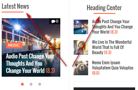
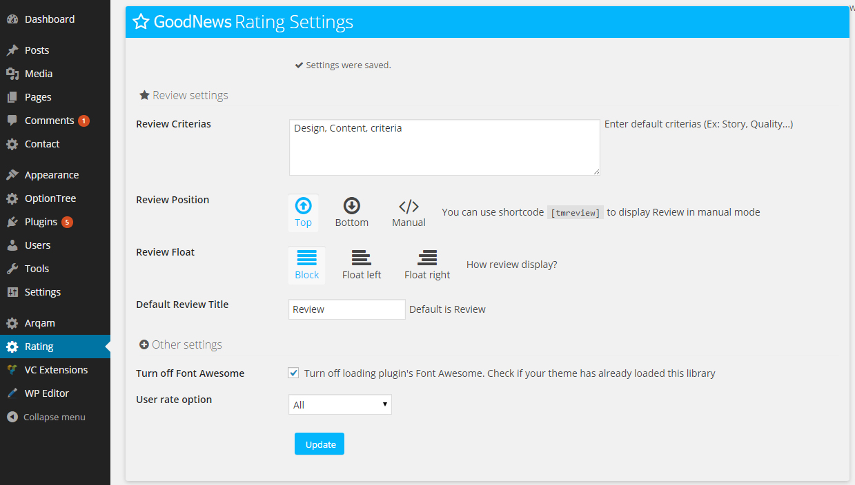
Absolute Rating Plugin
- The Rating plugin is included in the packge (/Installation Files/Plugins/plg-absolute-rating.zip). Once installed, you can access the settings page from Rating menu in admin
- Once you have set some default things here, in Post editing page, you will see Review where you can configure more settings or override default settings.
In addition,rating also allows Guests to evaluate for your posts. Here is the final results: the rating meta box for a post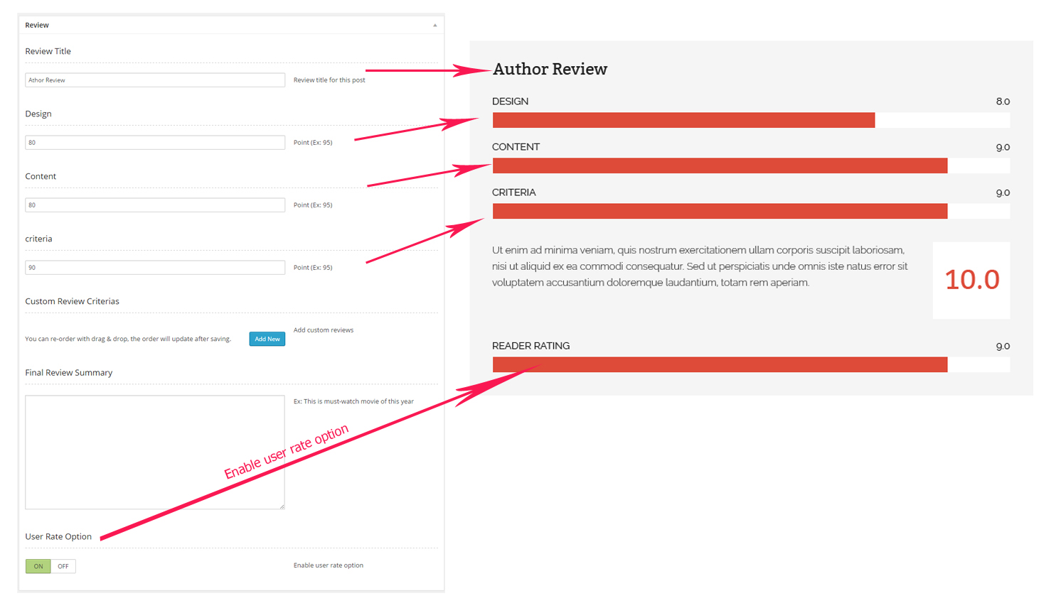
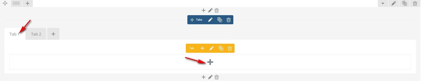
Easy Tab widget
Easy Tab plugin is included in the package. The Easy Tab widget help you to put two or more widgets into a tab
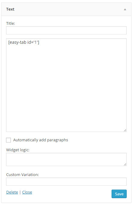
After installed, you will see there are several (2 by default) sidebars named "Easy Tab Widgets position N". This is where you build tab. Just drag widgets into the sidebar, and use appropriate shortcode to call the tab. For example, we have 2 widgets in "Easy Tab Widgets position 1" like this:
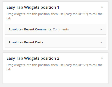
Now to display the tab, use [easy-tab id='1'] shortcode in your desired position, for example in another text widget in another sidebar.
To increase number of tab positions, go to Appearance > Theme Options > General > Number of Easy Tabs. For more information, check Easy Tab document
RTL & Translation
- Download and install this tool POEdit
- Open POEdit and load [/absolute/languages/absolute.po]
- Translate the text and save the file
- A file named absolute.mo is created. Rename it with Code Name of your language. For example, de_DE.mo for German - Deutsche. See language code list here http://codex.wordpress.org/WordPress_in_Your_Language
- Open [{wordpress root}/wp_config.php] and find this line define('WPLANG', '');. Change it with your language code, for example define('WPLANG', 'de_DE');
Licenses
- Bootstrap (MIT License v3.1.1) by Twitter, Inc - http://getbootstrap.com
- Modernizr ( MIT and BDS License v 2.6.2 ) - http://modernizr.com/download/
- jQuery FlexSlider (GPL License v2.2.2) by WooThemes - http://www.woothemes.com/flexslider/
- Superfish (MIT and GPL licenses v1.7.4) - https://github.com/joeldbirch/superfish
- Wow (MIT License v0.1.6) by Matthieu Aussaguel - https://github.com/matthieua/WOW
- Jquery.easing (BDS License v1.3) by George McGinley Smith - http://gsgd.co.uk/sandbox/jquery/easing/
- Caroufredsel (MIT and GPL License v 6.2.1 ) by Fred Heusschen - http://docs.dev7studios.com/jquery-plugins/caroufredsel
- Animation-come-in ( MIT License ) by Sam Sehnert
- Mousewheel (MIT License ) – https://github.com/brandonaaron/jquery-mousewheel
- TouchSwipe (GPL or MIT License) by Matt Bryson - https://github.com/mattbryson/TouchSwipe-Jquery-Plugin
- HoverIntent (MIT License ) by Brian Cherne – http://cherne.net/brian/resources/jquery.hoverIntent.html
- Parallax ImageScroll (MIT License ) - https://github.com/cyntss/Parallax-img-scroll/
- Lazy load (MIT License ) - https://github.com/tuupola/jquery_lazyload
- Path Loader (MIT License ) - http://www.codrops.com
Support
If you face problems with the installation or customization of our product please do not hesitate to contact us via our support ticket system: